Note
Go to the end to download the full example code.
It provides a worked example of the Ensemble Copula Coupling (ECC) approach, showing how to convert probabilities of exceeding thresholds into percentiles, and then reorder these percentiles to generate ensemble realizations. The example illustrates both the “quantile” (ECC-Q) and “transformation” (ECC-T) sampling options available within ECC, highlighting the differences in the resulting percentiles and realizations produced by each method.
# Authors: The IMPROVER developers
# SPDX-License-Identifier: BSD-3-Clause
Import necessary libraries and plugins
import iris.quickplot as qplt
import matplotlib.pyplot as plt
import numpy as np
import pandas as pd

from improver.ensemble_copula_coupling.ensemble_copula_coupling import (
    ConvertProbabilitiesToPercentiles,
    EnsembleReordering,
)
from improver.ensemble_copula_coupling.utilities import (
    CalculatePercentilesFromIntensityDistribution,
)
from improver.synthetic_data.set_up_test_cubes import (
    set_up_probability_cube,
    set_up_variable_cube,
)
Create a synthetic probability cube for precipitation rate#
We’ll create a 3x3 grid with probabilities of exceeding 1, 2, and 5 mm/h.
thresholds = np.array([1.0, 2.0, 5.0], dtype=np.float32)
prob_data = np.array(
    [
        [[0.8, 0.7, 0.6], [0.5, 0.4, 0.3], [0.2, 0.1, 0.0]],  # >1 mm/h
        [[0.6, 0.5, 0.4], [0.3, 0.2, 0.1], [0.1, 0.0, 0.0]],  # >2 mm/h
        [[0.0, 0.0, 0.0], [0.0, 0.0, 0.0], [0.0, 0.0, 0.0]],  # >5 mm/h
    ],
    dtype=np.float32,
)
prob_cube = set_up_probability_cube(
    data=prob_data,
    thresholds=thresholds,
    variable_name="lwe_precipitation_rate",
    threshold_units="mm h-1",
    spatial_grid="latlon",
    domain_corner=[40, -10],
)

# For the "transformation" option, we need a raw_cube of realizations.
# We'll create a 3x3x3 cube (3 realizations, 3x3 grid) with plausible
# precipitation rates.
raw_data = np.array(
    [
        [[1.2, 2.5, 4.8], [0.0, 0.0, 2.2], [0.0, 0.0, 1.0]],
        [[1.0, 0.0, 4.0], [1.1, 1.5, 2.5], [0.7, 0.9, 1.2]],
        [[0.8, 0.0, 3.5], [1.3, 0.0, 2.0], [0.0, 1.1, 1.3]],
    ],
    dtype=np.float32,
)
raw_cube = set_up_variable_cube(
    data=raw_data,
    name="lwe_precipitation_rate",
    units="mm h-1",
    spatial_grid="latlon",
    domain_corner=[40, -10],
)
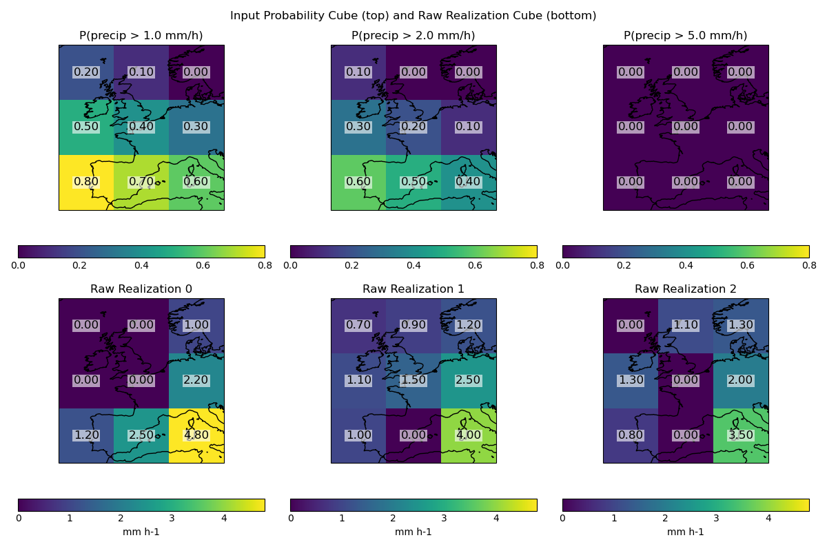
Visualise the input probability cube and the raw realization cube#
The probability plots show higher probabilities for the lower-left grid point. Within the raw realizations, the highest precipitation rates are in the bottom-right grid point (i.e. not aligned with the location of the highest probabilities).
def annotate_values_on_axes(cube, ax):
    """Annotate values from a 2D cube slice onto the plot."""
    arr = cube.data if cube.data.ndim == 2 else cube.data
    nrows, ncols = arr.shape
    # Get x/y coordinates from cube
    x = cube.coord("longitude").points
    y = cube.coord("latitude").points
    # Meshgrid for coordinates
    xx, yy = np.meshgrid(x, y)
    for i in range(nrows):
        for j in range(ncols):
            # Place annotation at the center of each pixel
            ax.text(
                xx[i, j],
                yy[i, j],
                f"{arr[i, j]:.2f}",
                ha="center",
                va="center",
                color="black",
                fontsize=12,
                bbox=dict(facecolor="white", alpha=0.6, edgecolor="none", pad=1),
            )


plt.figure(figsize=(12, 8))

# Find global min and max for the probability cube for consistent color scaling
prob_min = np.min(prob_cube.data)
prob_max = np.max(prob_cube.data)

# Plot probability cube (top row)
for i, thresh in enumerate(thresholds):
    plt.subplot(2, 3, i + 1)
    mesh = qplt.pcolormesh(prob_cube[i], vmin=prob_min, vmax=prob_max)
    plt.gca().coastlines()
    plt.title(f"P(precip > {thresh} mm/h)")
    annotate_values_on_axes(prob_cube[i], plt.gca())

plt.ylabel("Probability Cube")

# Find global min and max for the raw cube for consistent color scaling
raw_min = np.min(raw_cube.data)
raw_max = np.max(raw_cube.data)

# Plot raw realization cube (bottom row)
for i in range(raw_cube.coord("realization").points.size):
    plt.subplot(2, 3, i + 4)
    qplt.pcolormesh(raw_cube[i], vmin=raw_min, vmax=raw_max)
    plt.gca().coastlines()
    annotate_values_on_axes(raw_cube[i], plt.gca())
    plt.title(f"Raw Realization {i}")
plt.ylabel("Raw Cube")

plt.suptitle("Input Probability Cube (top) and Raw Realization Cube (bottom)")
plt.tight_layout()
plt.show()
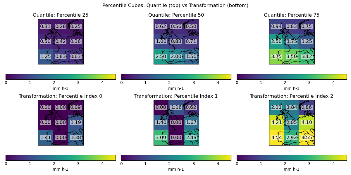
Convert probabilities to percentiles using “quantile” sampling#
The distribution, nan_mask_value, and scale_percentiles_to_probability_lower_bound options are set to here, but are only used for the “transformation” sampling option.
plugin = ConvertProbabilitiesToPercentiles(
    distribution="gamma",
    nan_mask_value=0.0,
    scale_percentiles_to_probability_lower_bound=True,
)
percentile_cube_quantile = plugin(prob_cube, no_of_percentiles=3, sampling="quantile")
/home/docs/checkouts/readthedocs.org/user_builds/improver/checkouts/latest/improver/ensemble_copula_coupling/utilities.py:611: UserWarning: Module numba unavailable. ConvertProbabilitiesToPercentiles will be slower.
  warnings.warn(
Convert probabilities to percentiles using “transformation” sampling#
plugin = ConvertProbabilitiesToPercentiles(
    distribution="gamma",
    nan_mask_value=0.0,
    scale_percentiles_to_probability_lower_bound=True,
)
percentile_cube_transformation = plugin(
    prob_cube,
    intensity_cube=raw_cube,
    no_of_percentiles=3,
    sampling="transformation",
)
plugin = ConvertProbabilitiesToPercentiles(
    distribution="gamma",
    nan_mask_value=0.0,
    scale_percentiles_to_probability_lower_bound=False,
)
percentile_cube_transformation_unscaled = plugin(
    prob_cube,
    intensity_cube=raw_cube,
    no_of_percentiles=3,
    sampling="transformation",
)
Single grid point examples#
To understand the differences between quantile and transformation sampling, we can examine the percentiles generated at specific grid points and the resulting precipitation rates.
Quantile sampling:
Generates the same percentiles at each grid point (equally spaced in percentile space).
Here, for a 3 member ensemble, the 25th, 50th and 75th percentiles.
Transformation sampling:
Generates different percentiles at each grid point based on the local distribution of probabilities.
Transformation sampling without scaling in this example generates percentiles that are more widely spaced. Applying the scaling pulls the non-zero percentiles further from zero. When the transformation sampling is applied without scaling, the precipitation rates are as expected, relative to quantile sampling with lower and higher precipitation rates given the wider percentiles being sampled at. When scaling is applied, the non-zero precipitation rates are increased.
Example: At the bottom-left grid point (probability 0.8 of exceeding 1 mm/h):
Quantile sampling (25th percentile): produces values above 1 mm/h
Transformation unscaled: 0.103 percentile produces values below 1 mm/h
Transformation scaled: rescales to the (0.2, 1.0) range, yielding 1.414 mm/h
plugin = CalculatePercentilesFromIntensityDistribution(
    distribution="gamma",
    nan_mask_value=0.0,
    scale_percentiles_to_probability_lower_bound=True,
)
percentile_values_to_sample_at = plugin(prob_cube, intensity_cube=raw_cube)

plugin = CalculatePercentilesFromIntensityDistribution(
    distribution="gamma",
    nan_mask_value=0.0,
    scale_percentiles_to_probability_lower_bound=False,
)
percentile_values_to_sample_at_unscaled = plugin(prob_cube, intensity_cube=raw_cube)

# Define grid points to display (row, col): (0,0), (0,2), (1,0)
grid_points = {
    "Bottom left (0,0)": (0, 0),
    "Bottom right (0,2)": (0, 2),
    "Centre left (1,0)": (1, 0),
}

# Prepare DataFrames for percentiles and sampled values
percentiles_df = pd.DataFrame(
    columns=[
        "Quantile",
        "Transformation (unscaled)",
        "Transformation (scaled)",
    ]
)
sampled_values_df = pd.DataFrame(
    columns=[
        "Quantile",
        "Transformation (unscaled)",
        "Transformation (scaled)",
    ]
)

for label, (i, j) in grid_points.items():
    # Quantile percentiles (always the same)
    quantile_percentiles = np.array([0.25, 0.5, 0.75])
    # Transformation percentiles (unscaled and scaled)
    trans_unscaled = percentile_values_to_sample_at_unscaled[:, i, j]
    trans_scaled = percentile_values_to_sample_at[:, i, j]

    # Store percentiles in DataFrame
    percentiles_df.loc[label] = [
        quantile_percentiles,
        trans_unscaled,
        trans_scaled,
    ]

    # Prepare x/y for np.interp
    x = np.insert(1 - prob_cube.data[:, i, j], 0, 0)
    y = np.insert(prob_cube.coord(var_name="threshold").points.copy(), 0, 0)

    # Sampled values
    quantile_sampled = np.interp(quantile_percentiles, x, y)
    trans_unscaled_sampled = np.interp(trans_unscaled, x, y)
    trans_scaled_sampled = np.interp(trans_scaled, x, y)

    # Store sampled values in DataFrame
    sampled_values_df.loc[label] = [
        quantile_sampled,
        trans_unscaled_sampled,
        trans_scaled_sampled,
    ]

# Display percentiles table
print("Percentiles at which the distribution is sampled:")
print(percentiles_df.map(lambda arr: np.round(arr, 3)))

# Display sampled values table
print("Precipitation rates obtained by sampling at these percentiles:")
print(sampled_values_df.map(lambda arr: np.round(arr, 3)))
Percentiles at which the distribution is sampled:
                             Quantile  ... Transformation (scaled)
Bottom left (0,0)   [0.25, 0.5, 0.75]  ...   [0.283, 0.617, 0.909]
Bottom right (0,2)  [0.25, 0.5, 0.75]  ...    [0.477, 0.665, 0.94]
Centre left (1,0)   [0.25, 0.5, 0.75]  ...     [0.0, 0.579, 0.921]

[3 rows x 3 columns]
Precipitation rates obtained by sampling at these percentiles:
                               Quantile  ... Transformation (scaled)
Bottom left (0,0)     [1.25, 2.5, 3.75]  ...   [1.414, 3.087, 4.544]
Bottom right (0,2)  [0.625, 1.5, 3.125]  ...   [1.384, 2.491, 4.551]
Centre left (1,0)       [0.5, 1.0, 2.5]  ...     [0.0, 1.396, 4.208]

[3 rows x 3 columns]
Visualise the percentile cubes side-by-side for quantile and transformation sampling —————————————————————— Percentiles generated using quantile sampling have the highest precipitation rate in the bottom-left grid point, which is consistent with the highest probabilities in the input. Percentiles generated using transformation sampling have the highest precipitation rates in the bottom-left, bottom-right and centre-left grid points.
plt.figure(figsize=(12, 6))

perc_min = np.min([percentile_cube_quantile.data, percentile_cube_transformation.data])
perc_max = np.max([percentile_cube_quantile.data, percentile_cube_transformation.data])

for i, perc in enumerate(percentile_cube_quantile.coord("percentile").points):
    plt.subplot(2, 3, i + 1)
    qplt.pcolormesh(percentile_cube_quantile[i], vmin=perc_min, vmax=perc_max)
    plt.gca().coastlines()
    plt.title(f"Quantile: Percentile {perc:.0f}")
    annotate_values_on_axes(percentile_cube_quantile[i], plt.gca())
for i, perc in enumerate(
    percentile_cube_transformation.coord("percentile_index").points
):
    plt.subplot(2, 3, i + 4)
    qplt.pcolormesh(percentile_cube_transformation[i], vmin=perc_min, vmax=perc_max)
    plt.gca().coastlines()
    plt.title(f"Transformation: Percentile Index {perc:.0f}")
    annotate_values_on_axes(percentile_cube_transformation[i], plt.gca())
plt.suptitle("Percentile Cubes: Quantile (top) vs Transformation (bottom)")
plt.tight_layout()
plt.show()
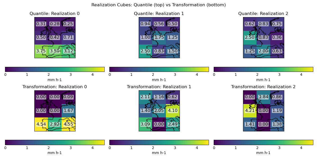
Reorder percentiles to create ensemble realizations (quantile)#
reordering_plugin = EnsembleReordering()
realization_cube_quantile = reordering_plugin(
    percentile_cube_quantile, raw_forecast=raw_cube
)
Reorder percentiles to create ensemble realizations (transformation)#
realization_cube_transformation = reordering_plugin(
    percentile_cube_transformation, raw_forecast=raw_cube
)
Visualise the realization cubes side-by-side for quantile and transformation sampling ——————————————————————- Quantile sampling leads to realization 0 having the highest precipitation rates in the bottom left grid point, matching the probabilities in the input. Transformation sampling leads to realization 0 having the highest precipitation rates in the bottom-left and bottom-right grid point, and realization 2 having a high precipitation rate in the centre left grid point. Transformation sampling has retained zero values that were present in the raw cube.
plt.figure(figsize=(12, 6))

real_min = np.min(
    [realization_cube_quantile.data, realization_cube_transformation.data]
)
real_max = np.max(
    [realization_cube_quantile.data, realization_cube_transformation.data]
)

for i in range(realization_cube_quantile.coord("realization").points.size):
    plt.subplot(2, 3, i + 1)
    qplt.pcolormesh(realization_cube_quantile[i], vmin=real_min, vmax=real_max)
    plt.gca().coastlines()
    plt.title(f"Quantile: Realization {i}")
    annotate_values_on_axes(realization_cube_quantile[i], plt.gca())
for i in range(realization_cube_transformation.coord("realization").points.size):
    plt.subplot(2, 3, i + 4)
    qplt.pcolormesh(realization_cube_transformation[i], vmin=real_min, vmax=real_max)
    plt.gca().coastlines()
    plt.title(f"Transformation: Realization {i}")
    annotate_values_on_axes(realization_cube_transformation[i], plt.gca())
plt.suptitle("Realization Cubes: Quantile (top) vs Transformation (bottom)")
plt.tight_layout()
plt.show()
Total running time of the script: (0 minutes 2.424 seconds)